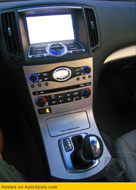
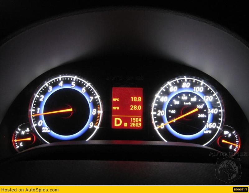
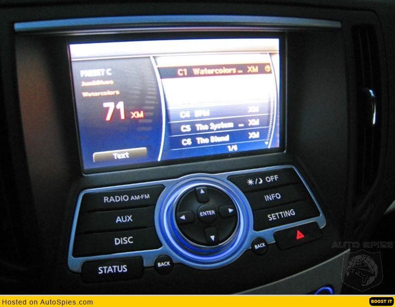
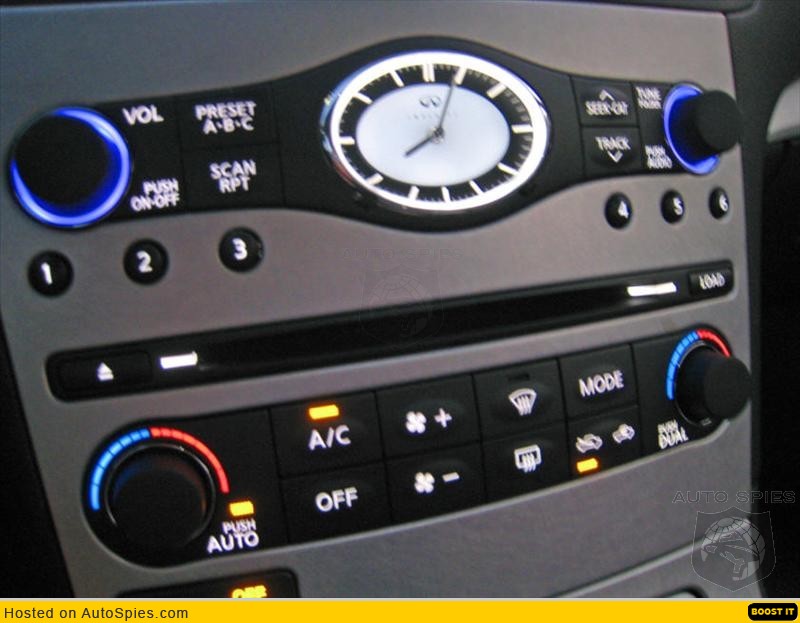
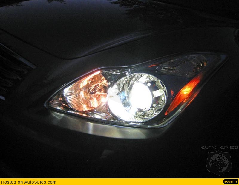
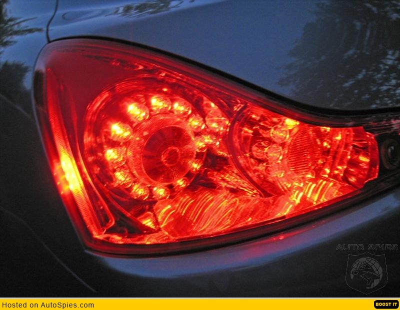
G37 coupe instruments at night
#1
#5
I complained a lot about this when the '07 G35 came out but I really, really wish they had a model without the screen. I hate screens in the middle of my dashboard. At least the 1st Gen had a cover.
I also think the screen makes the car look a lot less elegant and less sporty all at the same time. I also just happen to love my 2D navigation system I use now in my Maxima. I've used many Nav systems and prefer to do it the old fashioned way.
Holy cow, I can just see this country in 50 years when some massive EMP experiment wipes out all electronics across the continent and NOBODY will have a clue how to even get outside their house... At least they use an analog clock on the G37. I guarantee you a number of buyers won't know how to read it..
Anyway, the dash is nice but a "no screen" option would be a major plus for me. I'd even pay extra for it..
#6
Well... since we're ragging... I've also never liked temperature controls with red and blue like it's some kind of bathroom faucet. What are we... kids? If we can use a nav and a gas pedal then we can damn well tell which way to turn a temp. dial.
So many cars use this red/ blue designation for temperature and it's so freaking unnecessary. Plus it seems that every car manufacturer that does this uses the brightest, ugliest, loudest "primary" hue of red and blue, instead of something more subtle. Just my little pet peeve...
(But I still love it!!!)

#7
Traveling Administrator
Joined: Nov 2003
Posts: 3,744
Likes: 3
From: Rothesay, New Brunswick, Canada
I absolutely love the look of the gauges, dash, and console area at night. The gauges look spectacular and are really easy on the eyes I find. The night setting on the LCD works extremely well. And there are two LED lights on the roof that shine directly down on the console area.......a very nice touch by Infiniti IMO.
Here is some night shots of mine. I apologize for the poor picture quality in a couple of them.
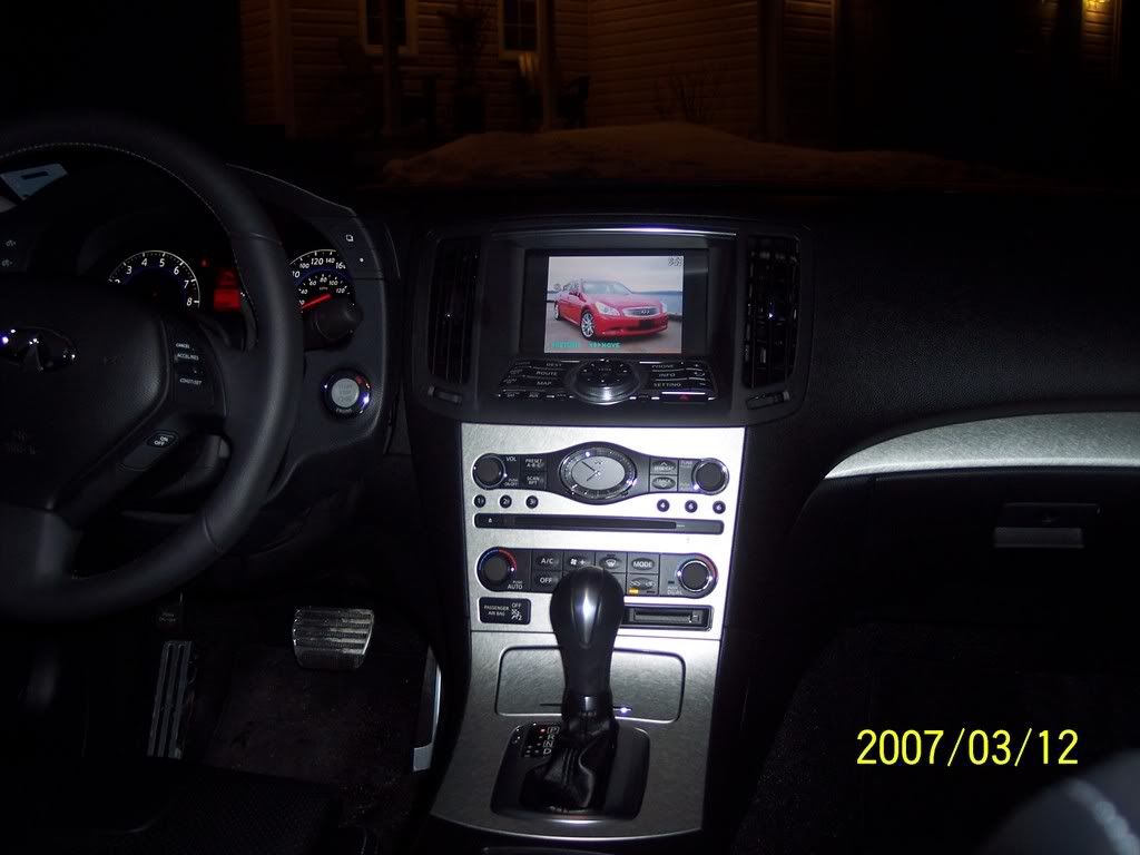
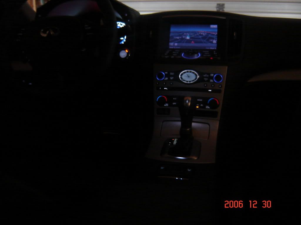
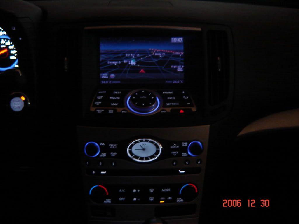
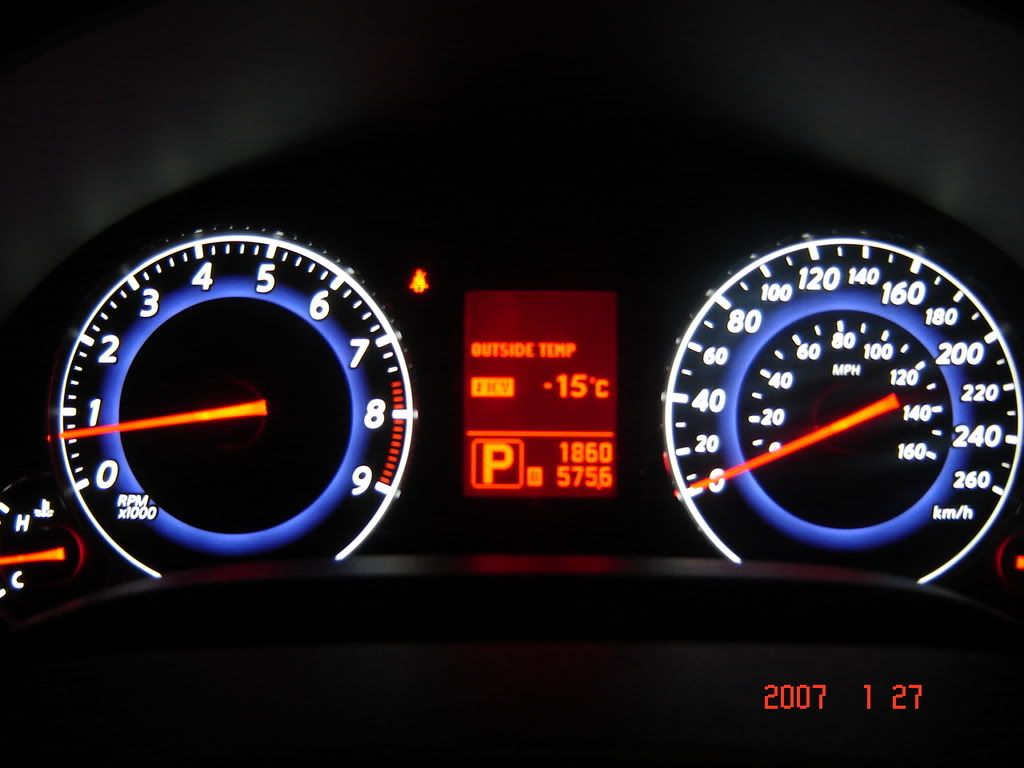
Here is some night shots of mine. I apologize for the poor picture quality in a couple of them.


Trending Topics
#10
Thanks for posting the night pics, the gauges and colors look awesome. I am glad they switched up the colors and I really like the fact that you still get the information screen even if you don't get the navigation package.
#13
Traveling Administrator
Joined: Nov 2003
Posts: 3,744
Likes: 3
From: Rothesay, New Brunswick, Canada
Originally Posted by bostonmerlin
thanks for the pics Garnet. I've heard about "building footprint" on g35 2007 sedan navs.. can you elaborate on how that looks.. or a few pics?
tks
tks


